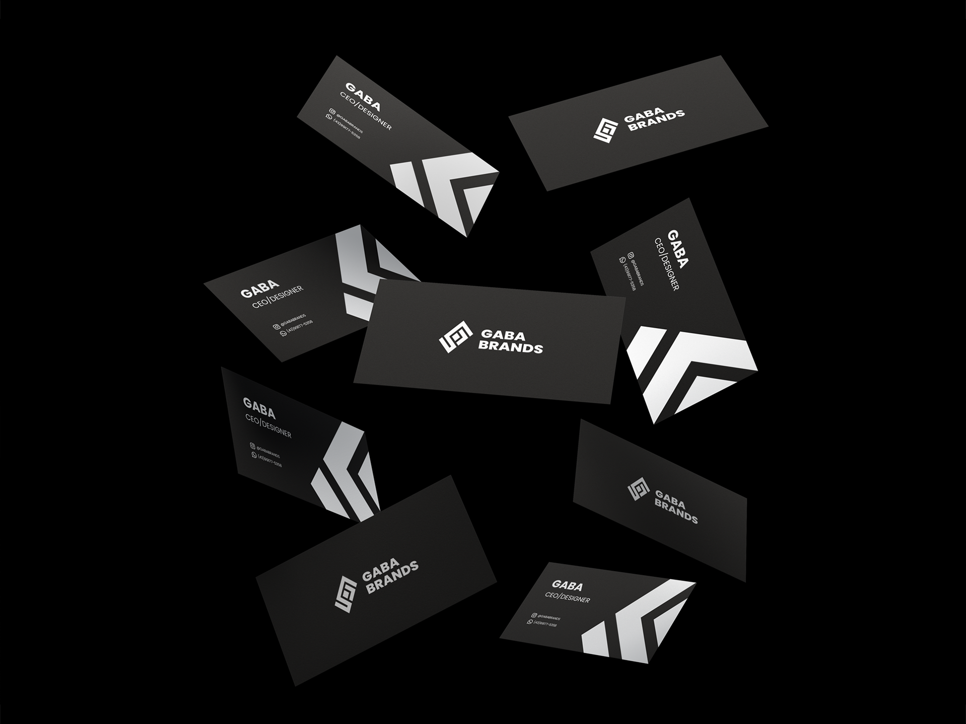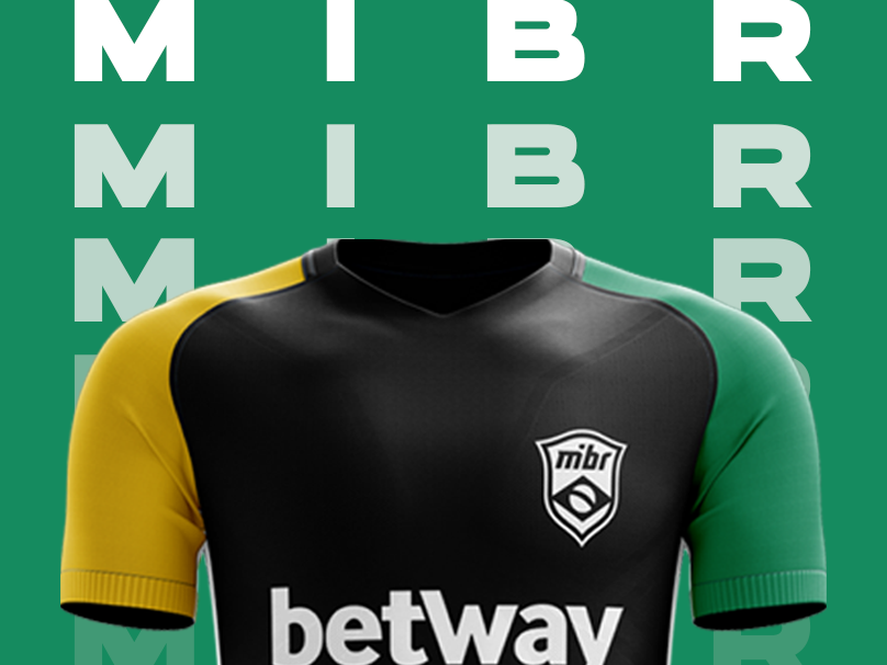
GABABRANDS ©
"Desconstruindo o óbvio e reconstruindo o novo"
A ideia desse projeto é ter uma identidade visual consistente e descolada.
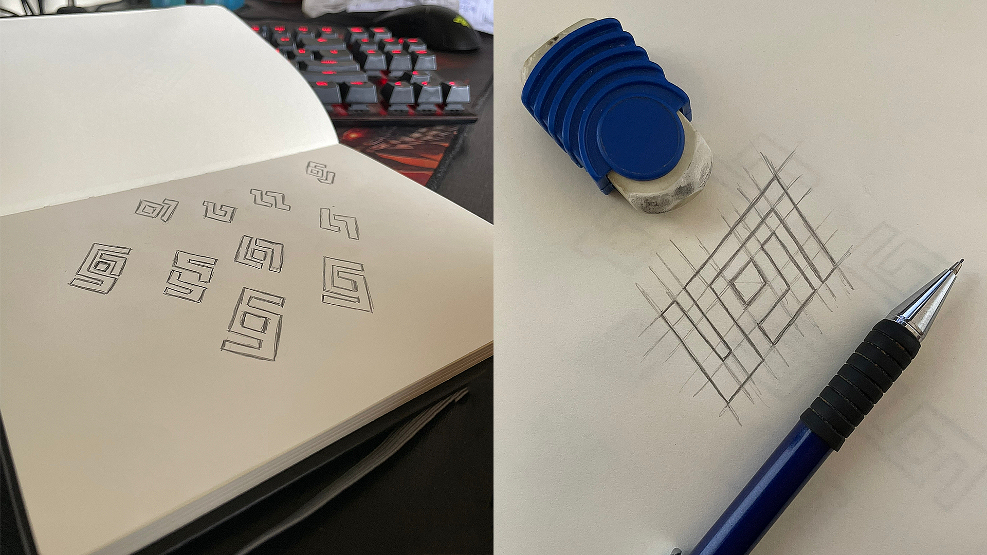
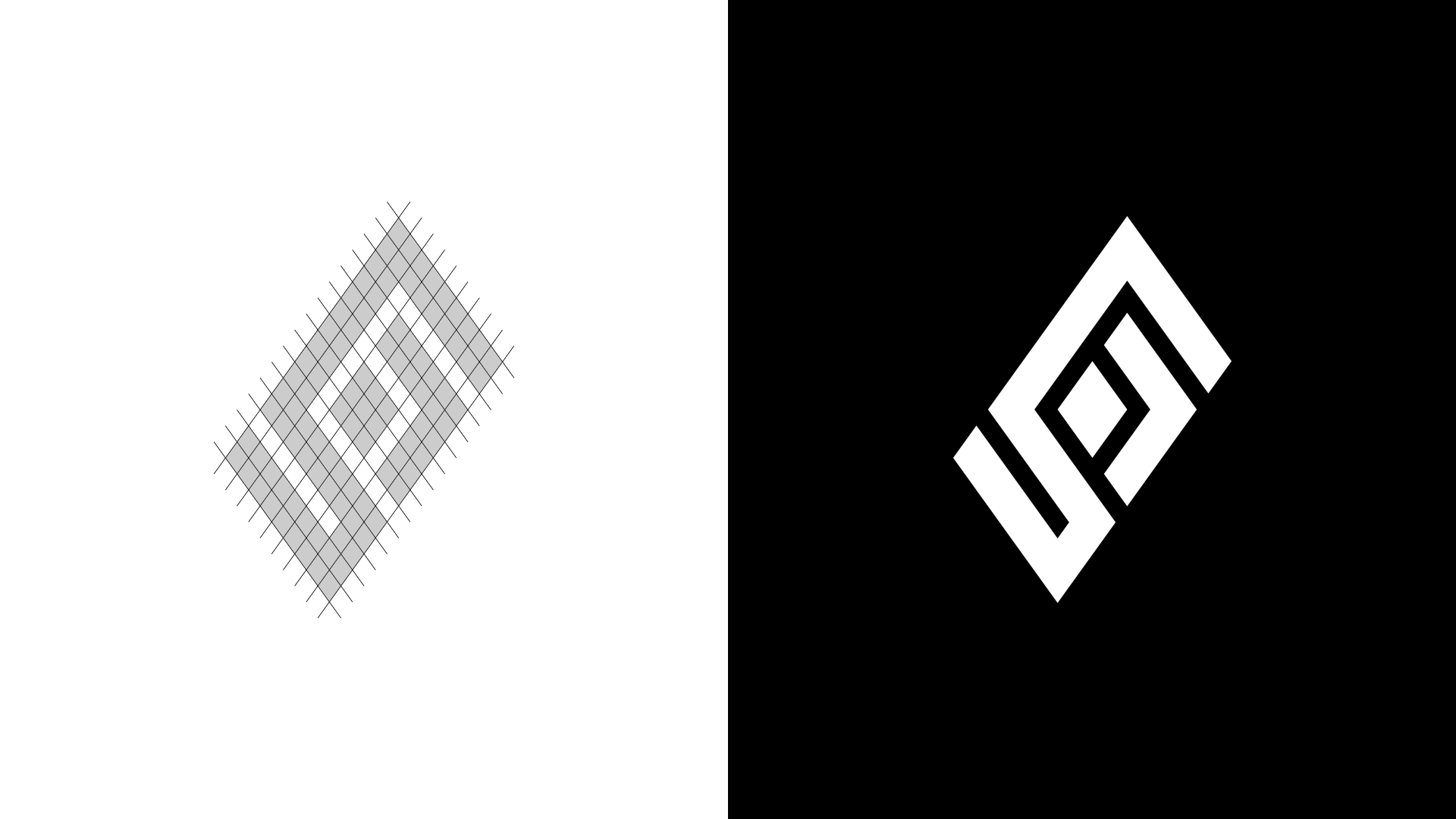
Então fui atrás de referências, pesquisei por um bom tempo e percebi que não haviam muitos trabalhos com a forma em losango.
Um losango é um polígono que possui quatro lados congruentes. Sendo assim, o losango é formado por segmentos de reta, chamados de lados do polígono, que se encontram apenas pelas extremidades. Esses segmentos de reta acabam formando uma figura fechada e seus lados não se cruzam.
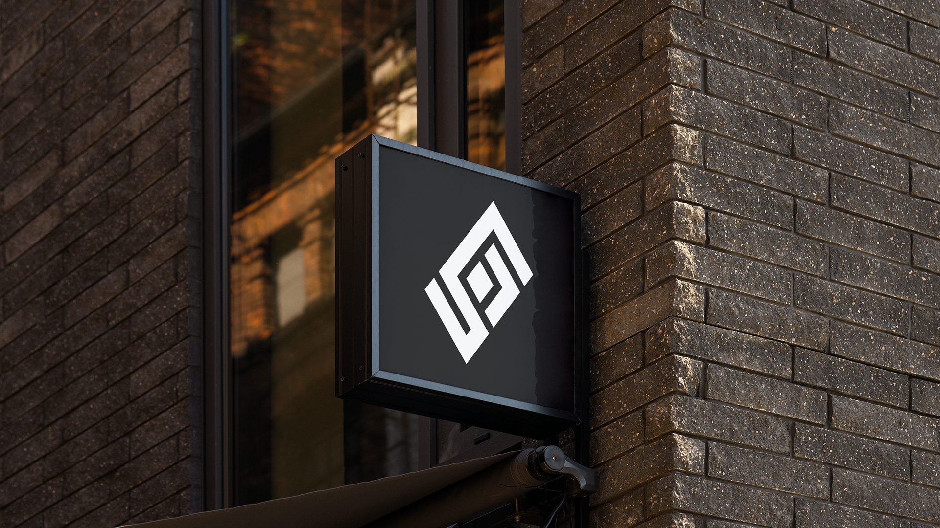
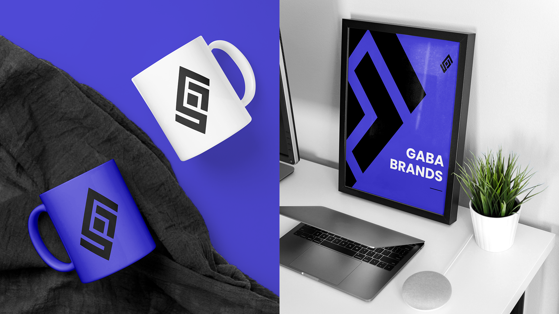
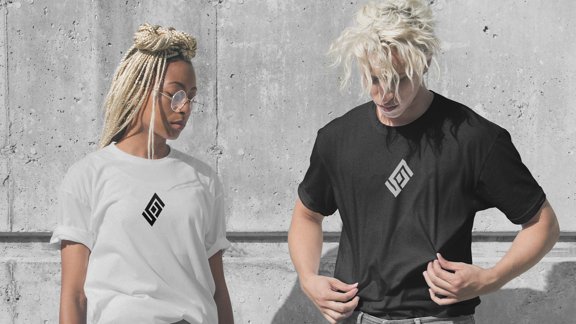
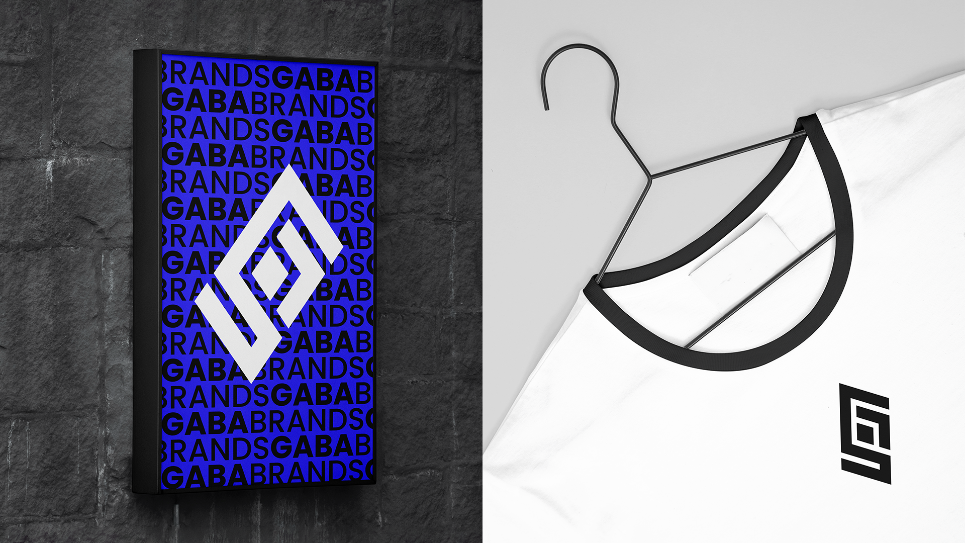
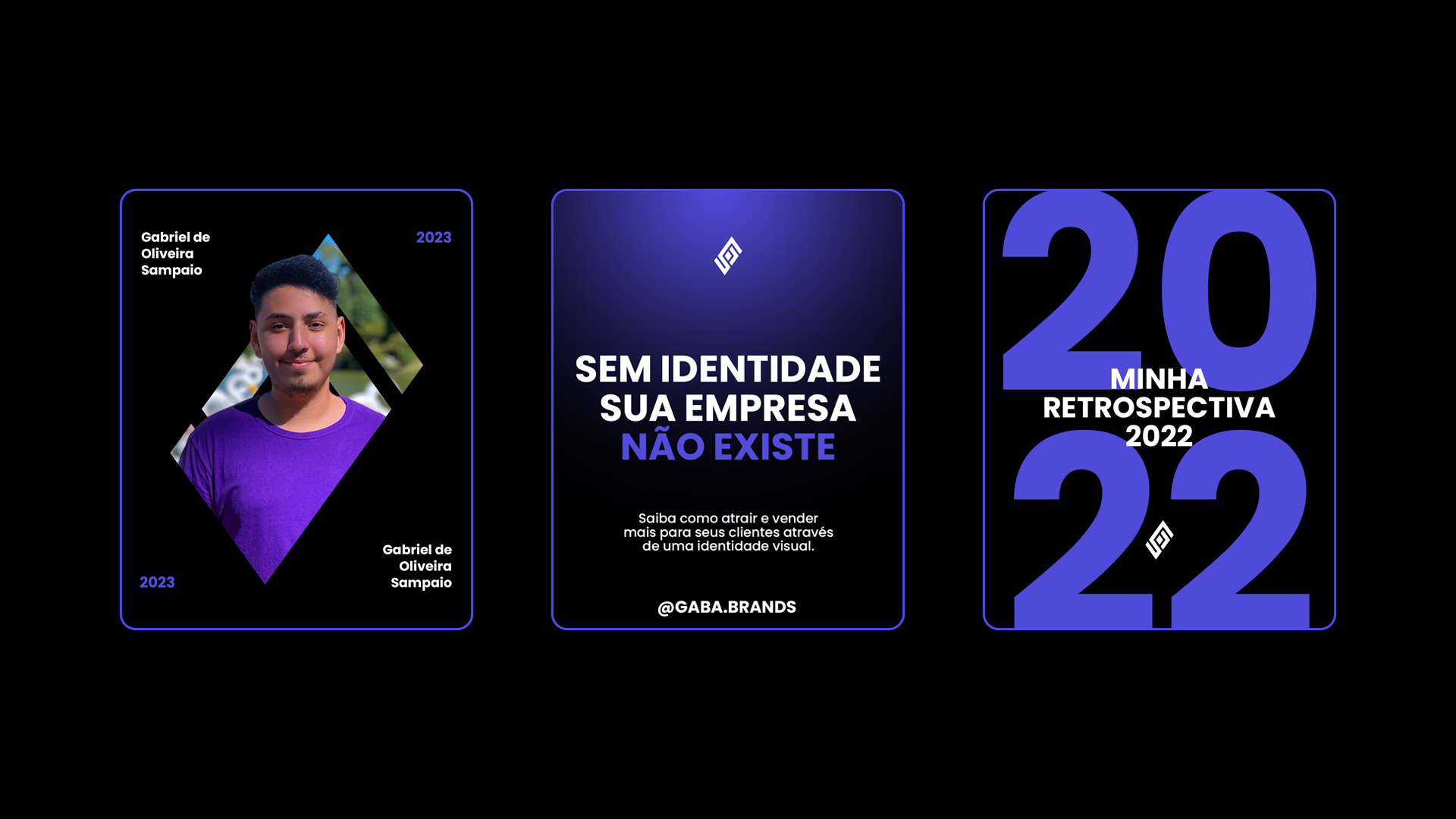
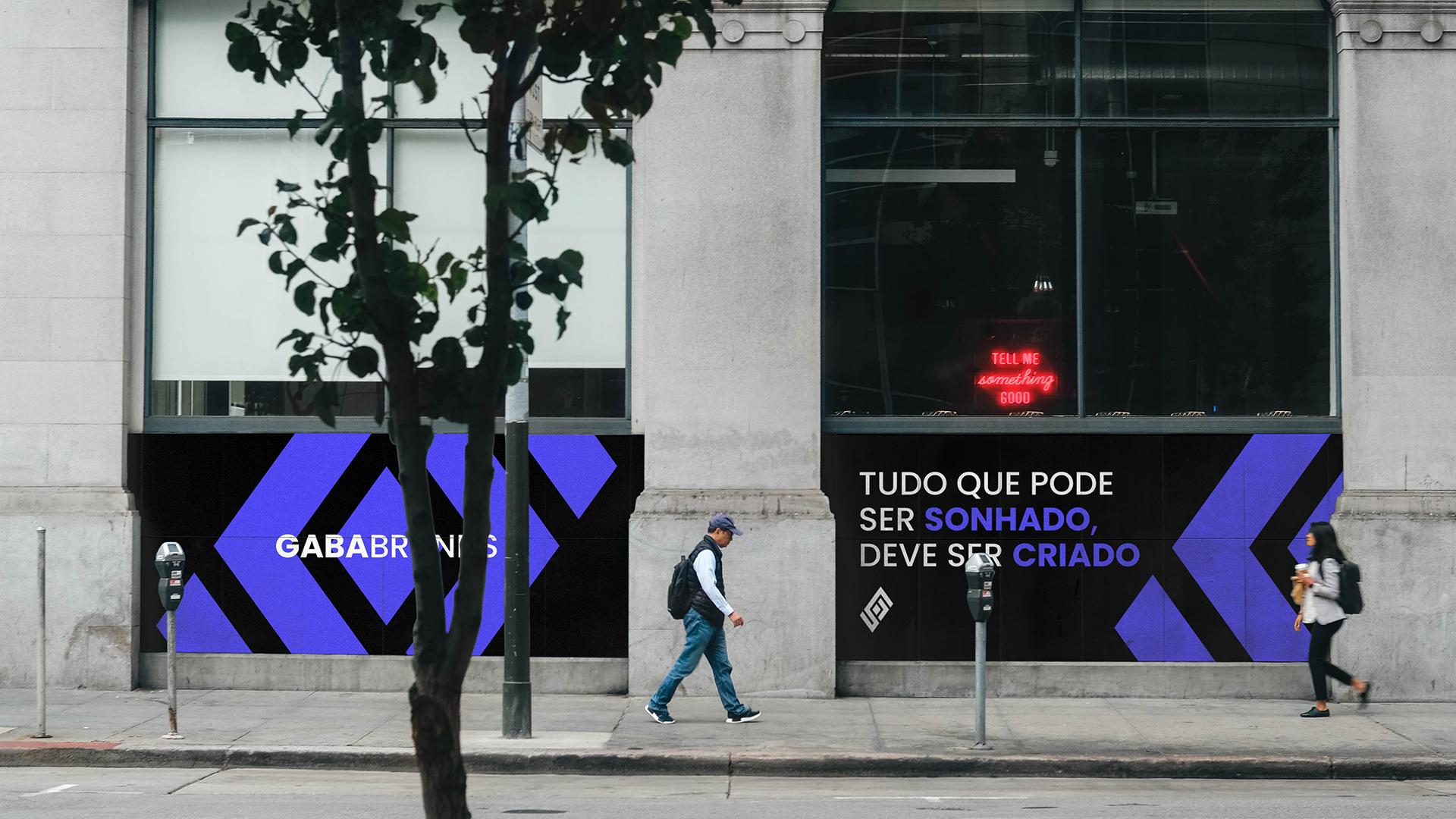
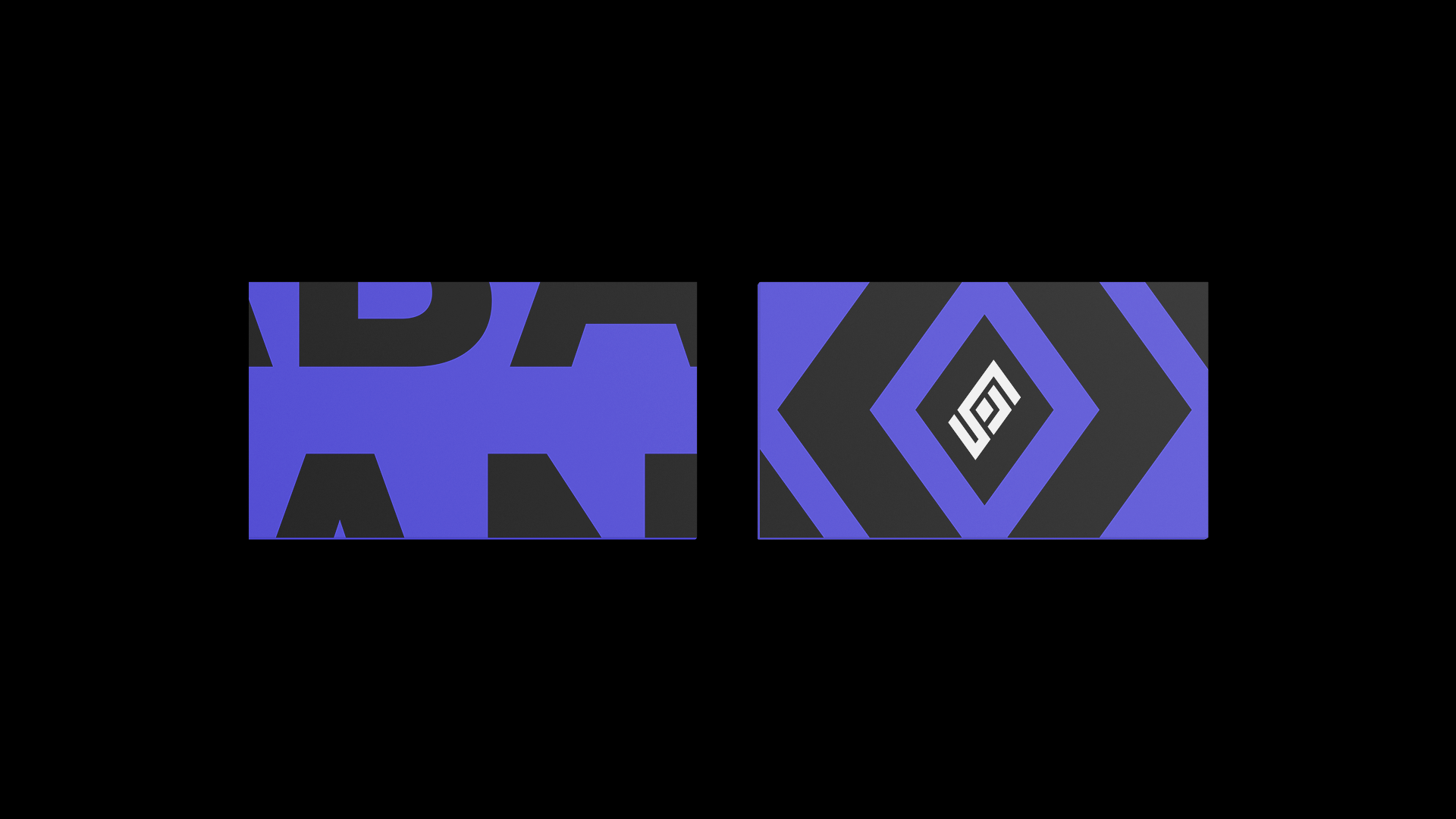
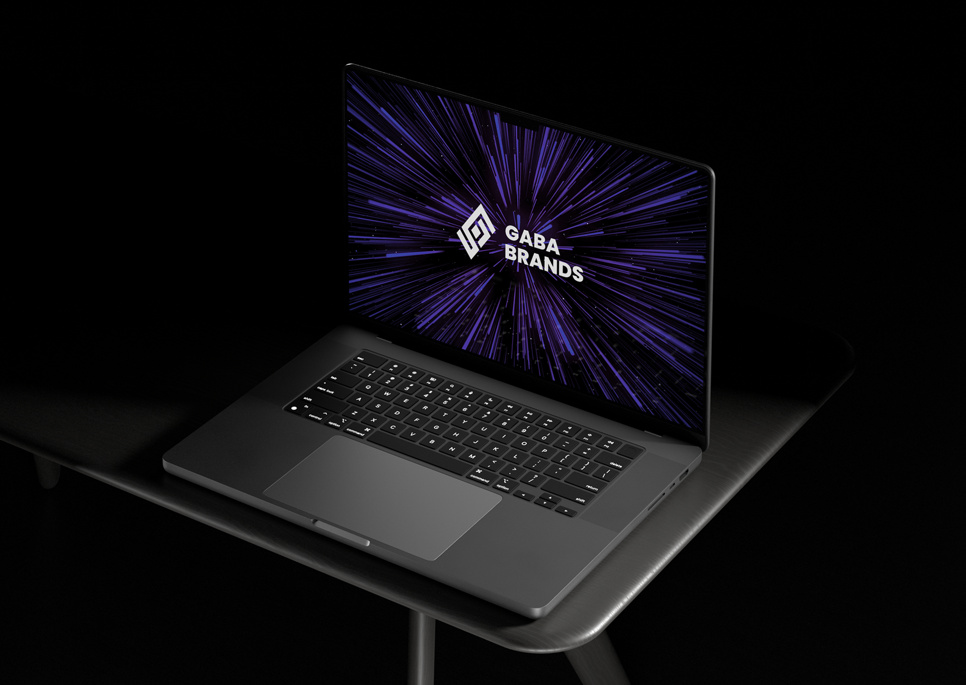
Juntei o losango com as minhas iniciais [G e S] para dar vida ao símbolo da marca!
O símbolo precisava ser forte, então fiz dezenas de rascunhos até achar algo que ficasse visualmente bonito e que tivesse os conceitos que eu queria.
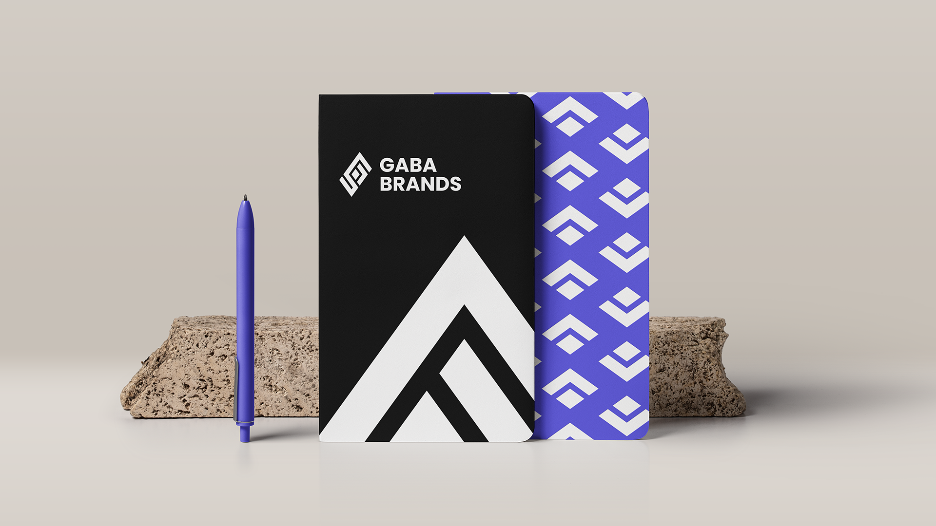
A família tipográfica foi escolhida para dar contraste de formas entre a fonte e o símbolo. Além de fácil leitura, a Poppins é uma fonte super versátil, tendo uma família bem grande.
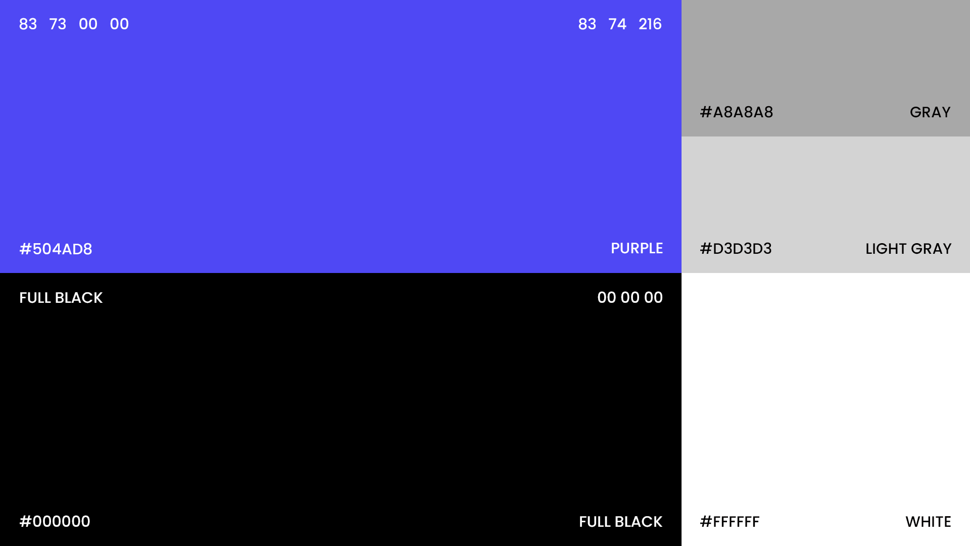
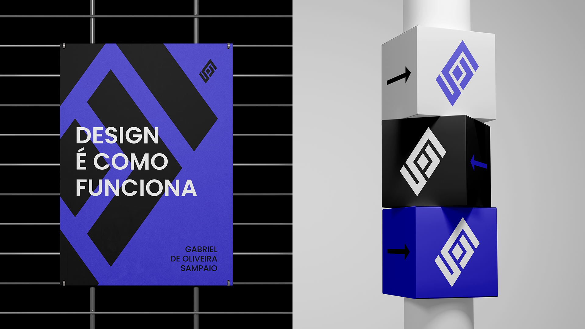
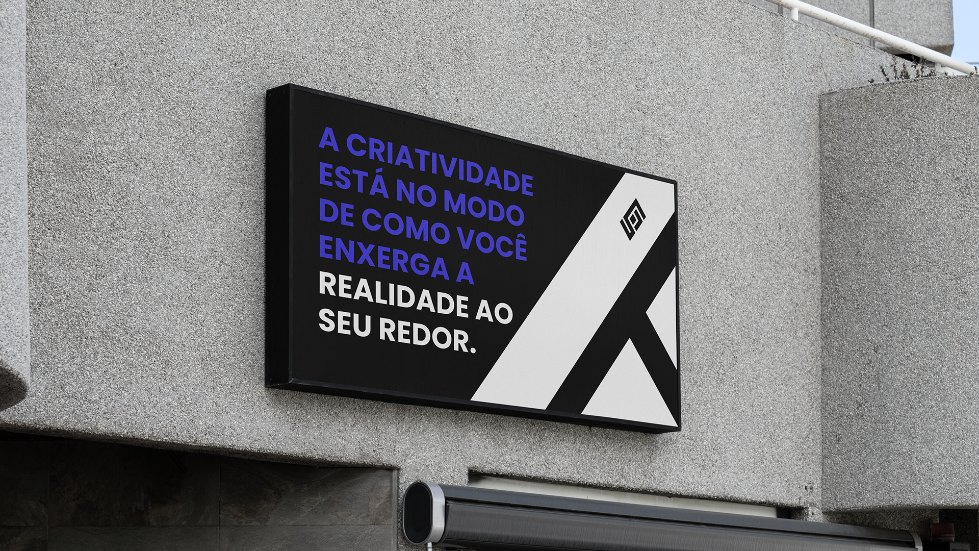
A cor roxa foi escolhida por remeter muito à criatividade, algo que um designer precisa ter para criar cases de sucesso. Além desse roxo ser bem descolado junto com o resto das cores, que são as cores básicas como o preto e o branco, além de ter pouca participação dos cinzas.
""Deconstructing the obvious and rebuilding the new""
The idea of this project is to have a consistent and cool visual identity.
So I went looking for references, researched for a long time and realized that there weren't many works with the diamond shape.
A rhombus is a polygon that has four congruent sides. Thus, the rhombus is formed by straight line segments, called the sides of the polygon, which meet only at the ends. These line segments end up forming a closed figure and their sides do not intersect.
I joined the diamond with my initials [G and S] to bring the brand symbol to life!
The symbol needed to be strong, so I made dozens of sketches until I found something that looked good and had the concepts I wanted.
The typographic family was chosen to provide a contrast of shapes between the font and the symbol. In addition to being easy to read, Poppins is a super versatile font, having a very large family.
The purple color was chosen because it refers a lot to creativity, something a designer needs to have to create successful cases. In addition to this purple being very cool along with the rest of the colors, which are the basic colors like black and white, in addition to having little participation of grays.